Kitify
Curated stationery kits for design students with easy sell, rent, and auction for economic and ecological benefits.
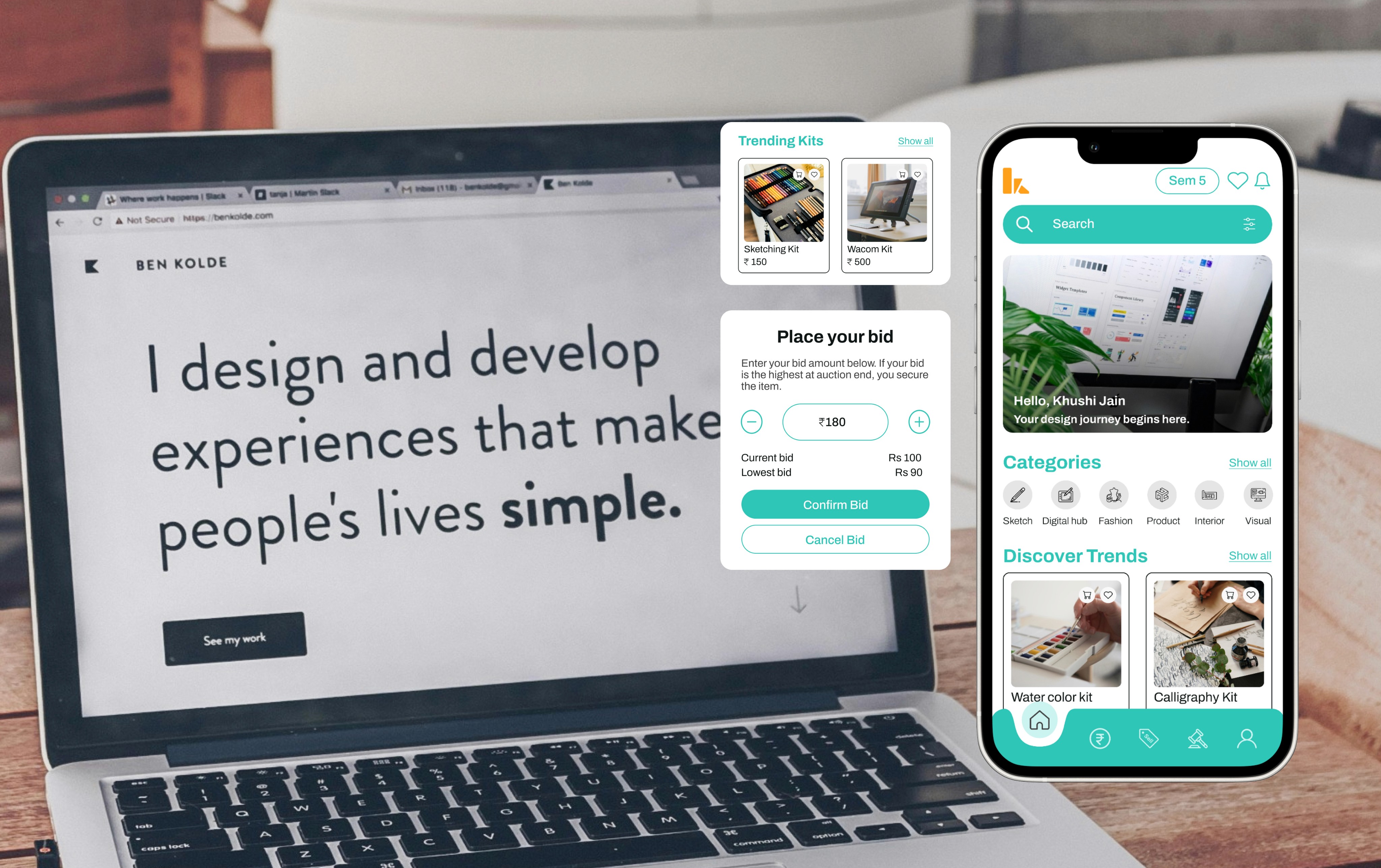

Kitify
Domain
E-commerce
Platform
Mobile Application
Duration
3 weeks
Eco-Friendly and Budget-Conscious Stationery Kits for Design Students
Providing design students the chance to buy or lease carefully curated stationery kits, all while including a special feature for exclusive and high-end goods. Maintaining a focus on Eco-friendliness, the platform encourages the sale or lease of personal items, thereby tackling both green and budgetary challenges.
The Context
The proposed platform aims to provide design students with sustainable and affordable stationery solutions. It offers carefully curated stationery kits that can be bought or leased, as well as a marketplace for students to buy or sell personal stationery items. By promoting resource sharing and reducing waste, the platform aims to address both environmental and financial concerns for design students.
Understanding the Bigger Picture
The Problem Statement
Providing design students the chance to buy or lease carefully curated stationery kits, all while including a special feature for exclusive and high-end goods. Maintaining a focus on Eco-friendliness, the platform encourages the sale or lease of personal items, thereby tackling both green and budgetary challenges.
The Journey:
from chaos to clarity
Empathize
User research
Interview
Personas
Define
Ideation
Analyze
Ideate
Navigation flow
Branding
Wireframes
Design
User Interface
Accessibility
Test
Heuristic Evaluation
Takeaways
Feedback
Digging for Insights
I interviewed students from various departments and semesters, examining their challenges, preferences, and the dynamics of demand and supply. This research helps us pinpoint items that can be rented, evaluate their usability, and comprehend emotional connections.
The Struggle Is Real
Environmental Concerns
Students are increasingly conscious of their impact on the environment but often struggle to reconcile this with their purchasing habits.
Financial Strain
Limited budgets lead to prioritizing cheaper items that might not be durable or Eco-friendly, exacerbating the cycle of over-consumption.
Sense Of Ownership
Balancing the personalized tools and shared resources poses a challenge. Doubts about the quality of rented items versus owned ones.
Storage Challenges
Dorm rooms and shared spaces make storing unnecessary items a hassle, yet the cycle continues due to the perceived lack of alternatives.
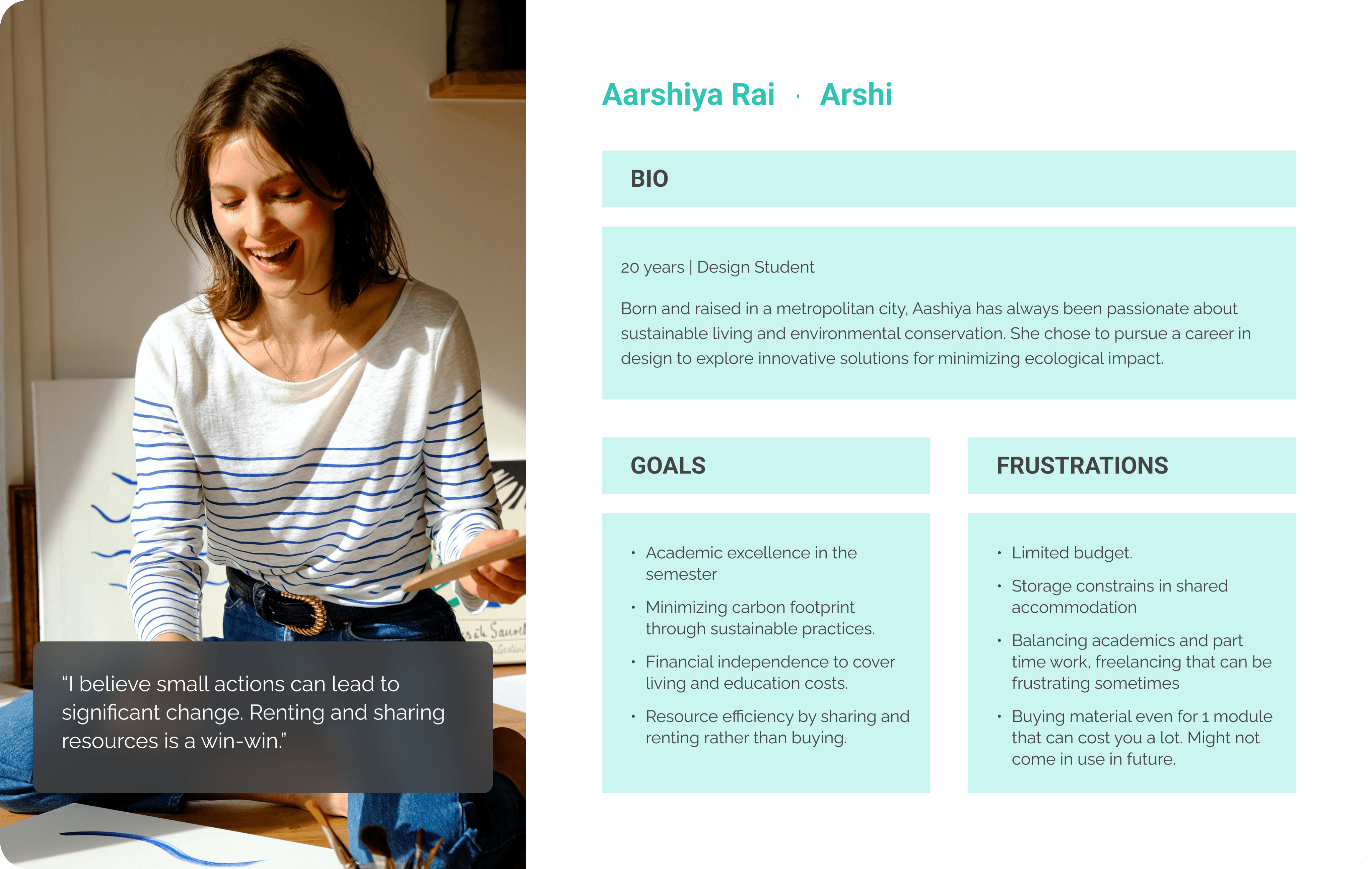
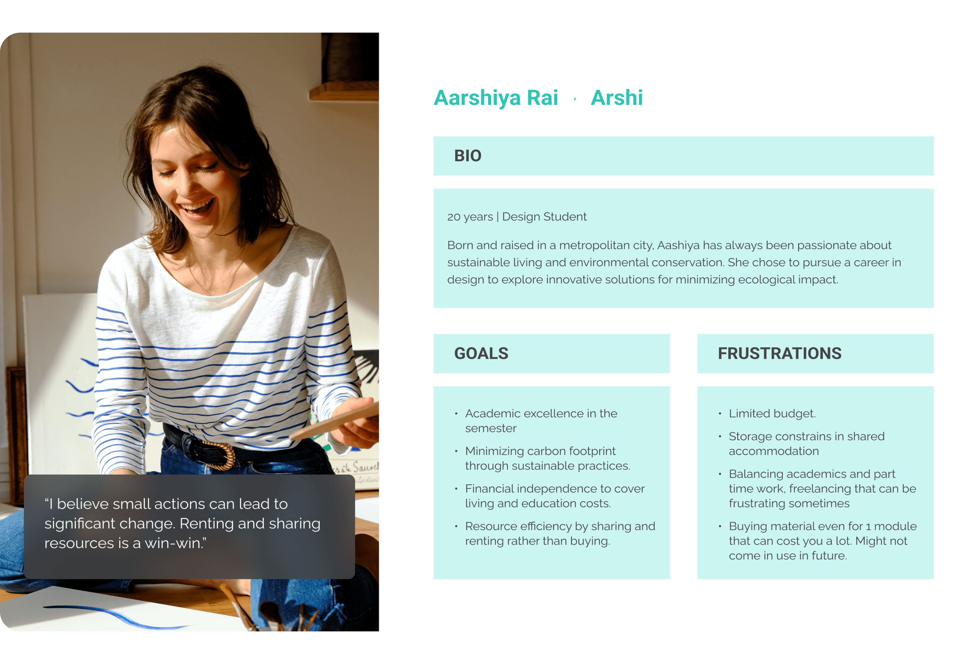
User Persona
User personas were created to understand the target audience's needs, goals, and challenges, ensuring designs are user-centered. This approach helps tailor solutions effectively to real user problems.



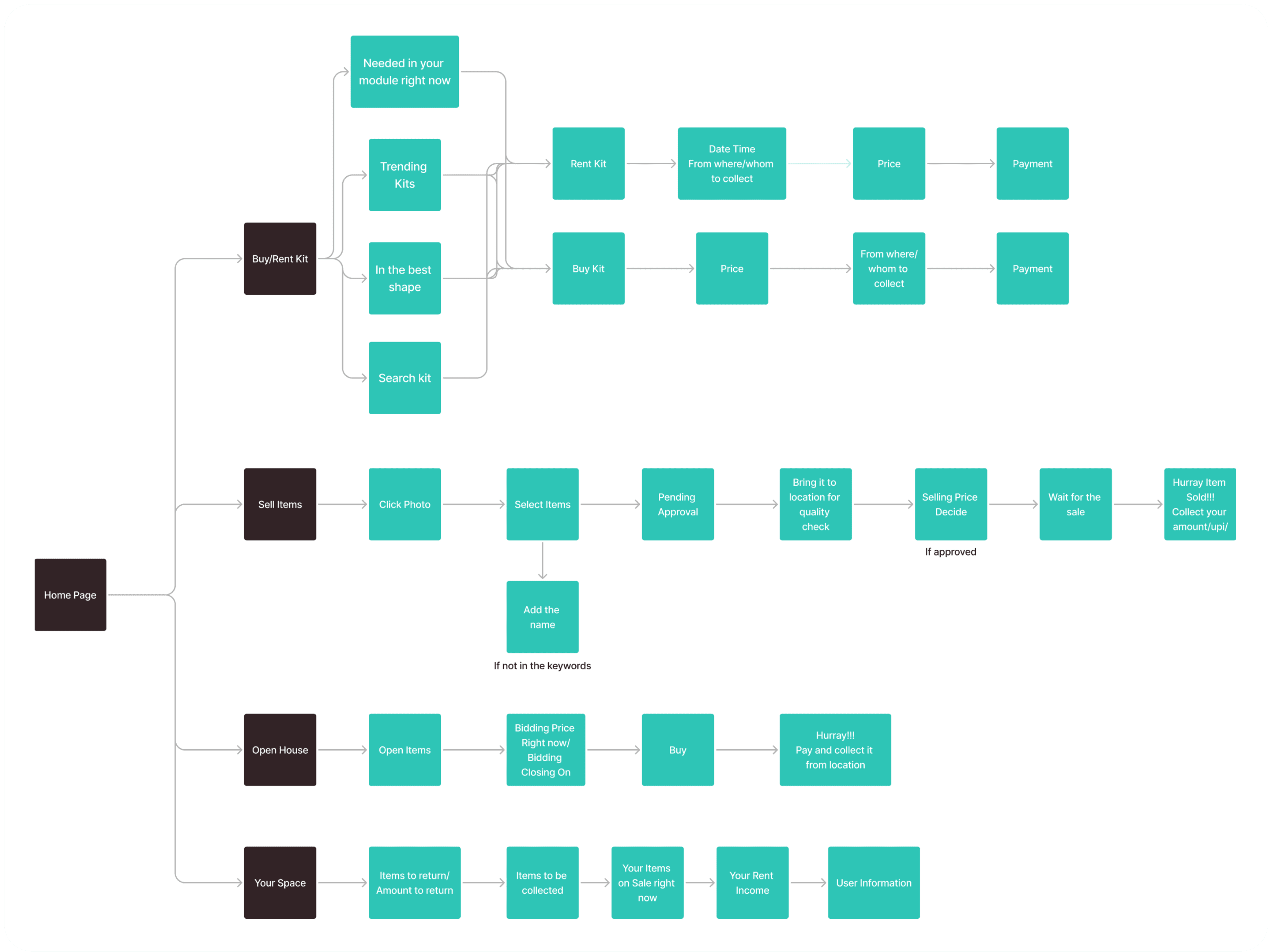
Navigation Flow
Navigation flow was designed to ensure a seamless and intuitive user experience. It maps out the user journey to make interactions smooth and efficient across all screens.



Purpose in every detail
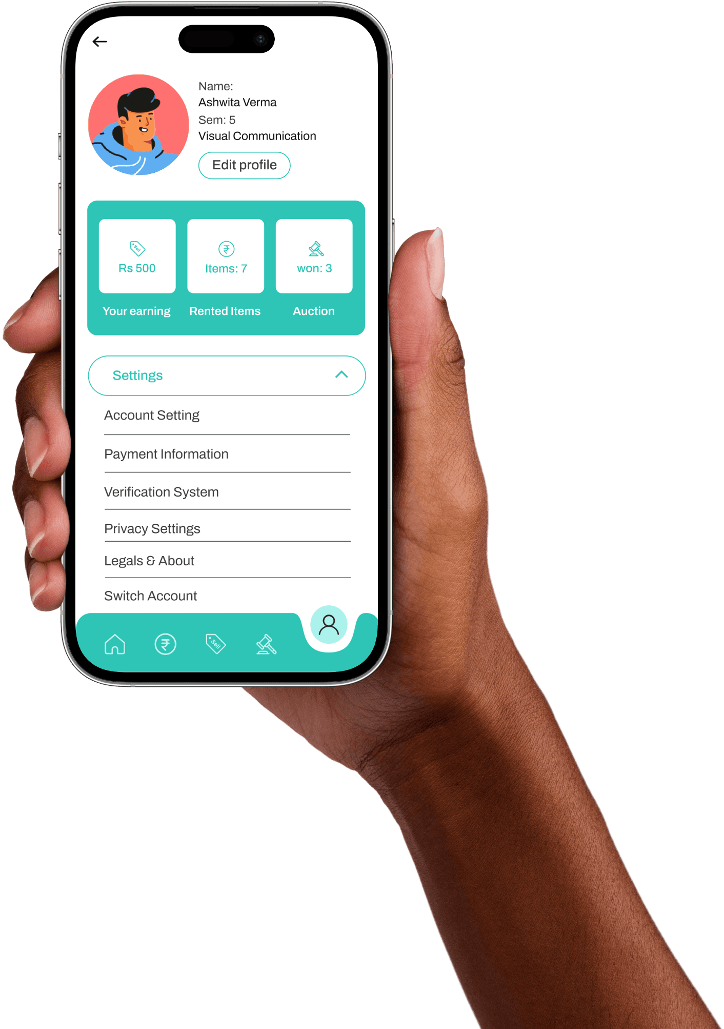
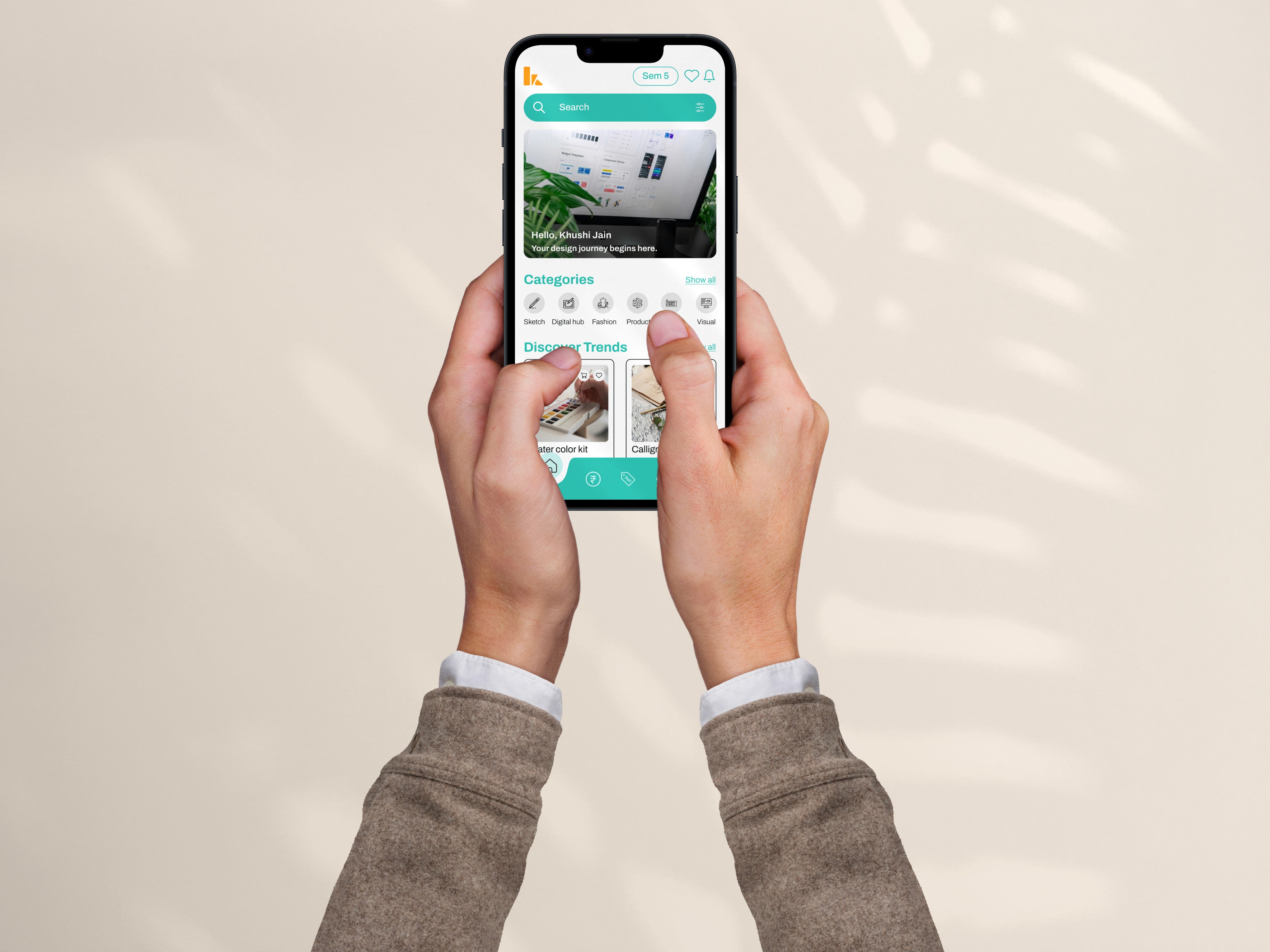
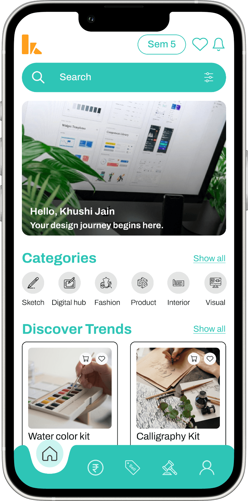
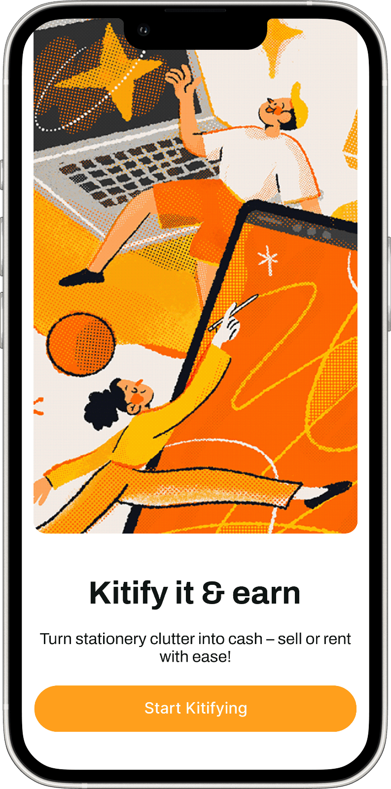
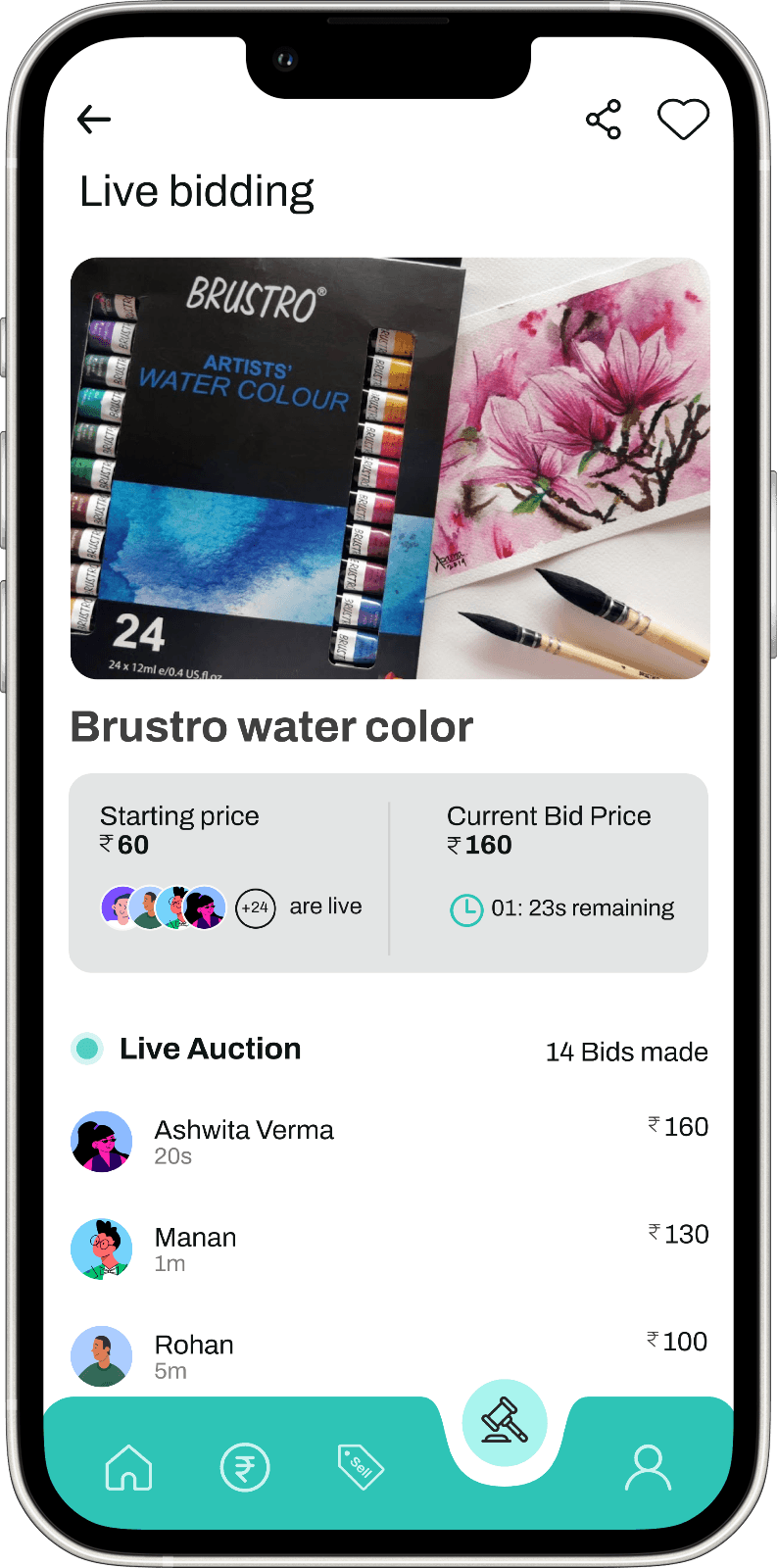
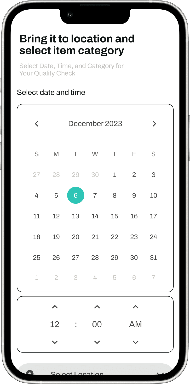
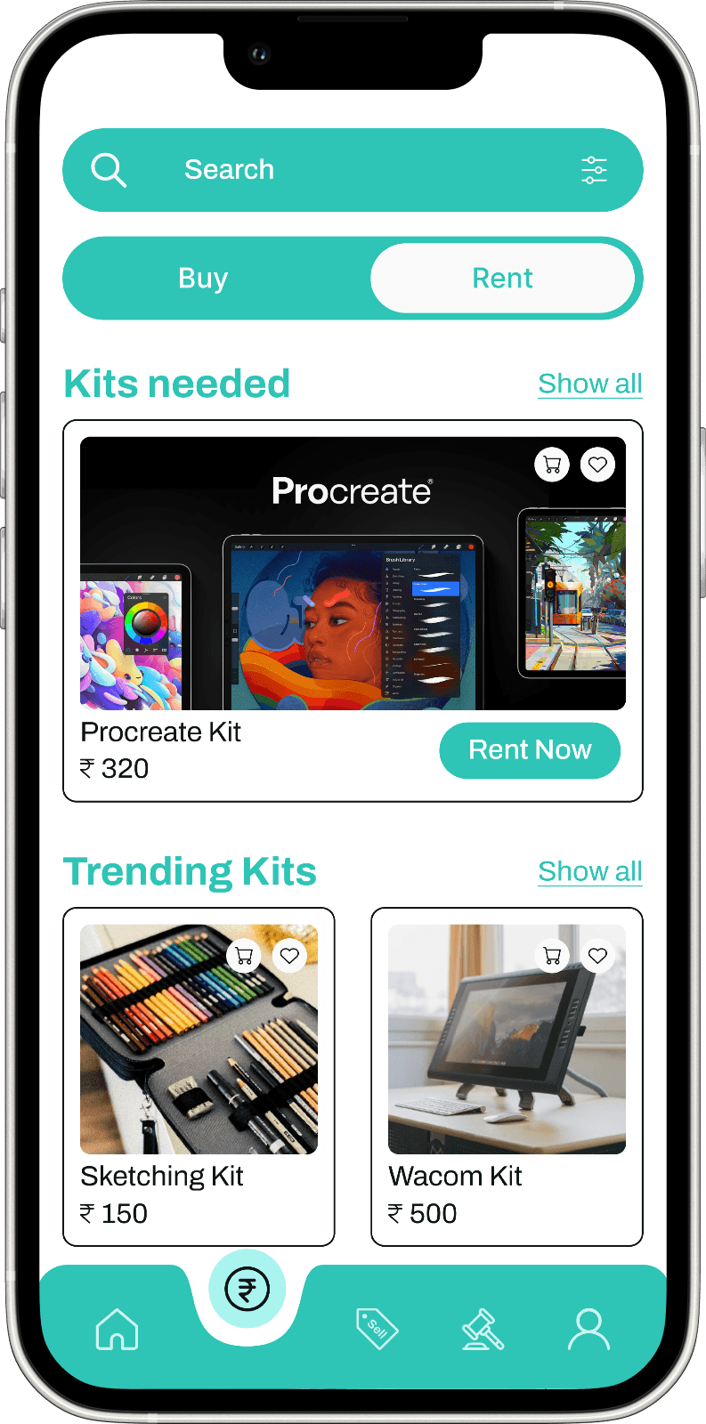
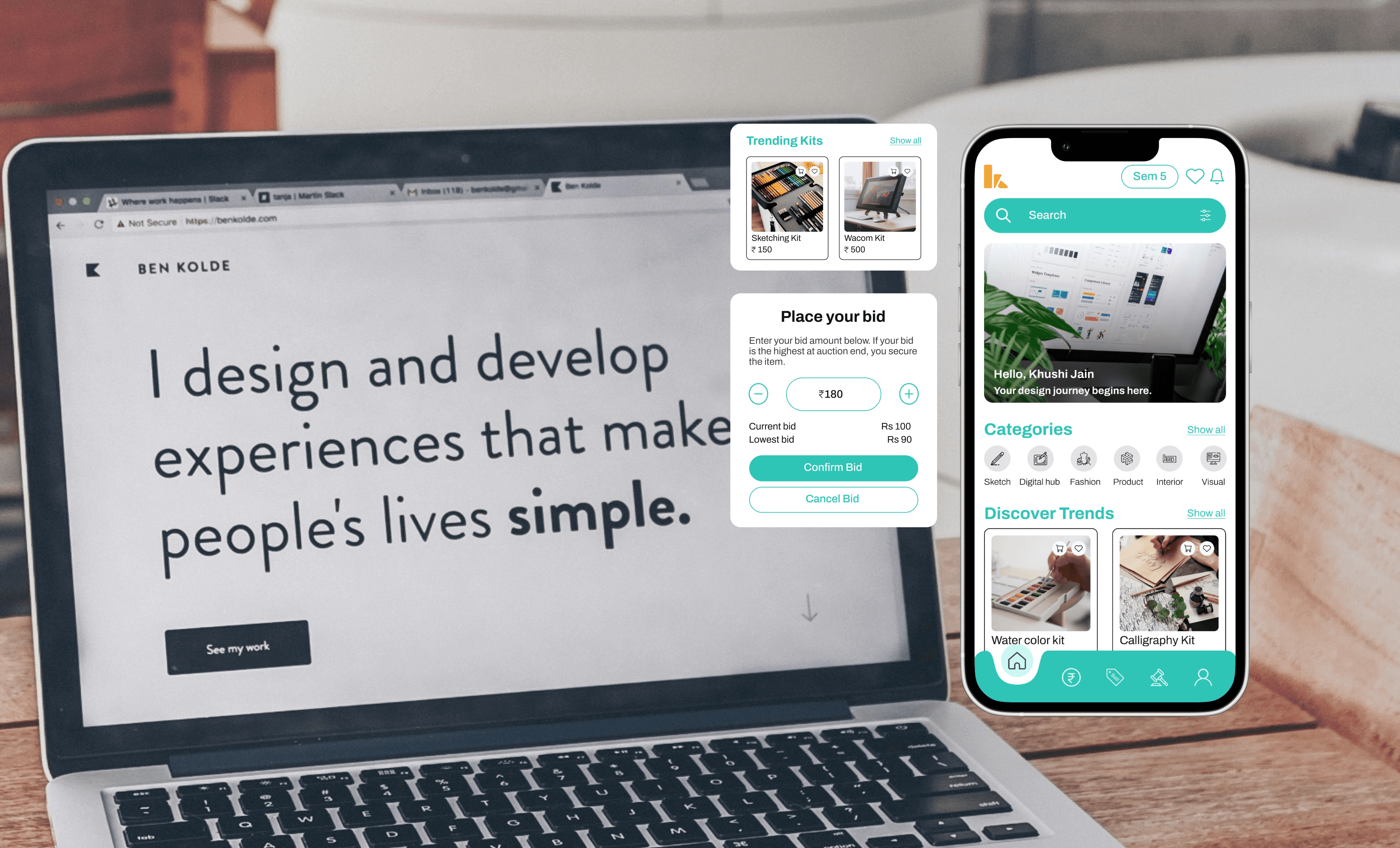
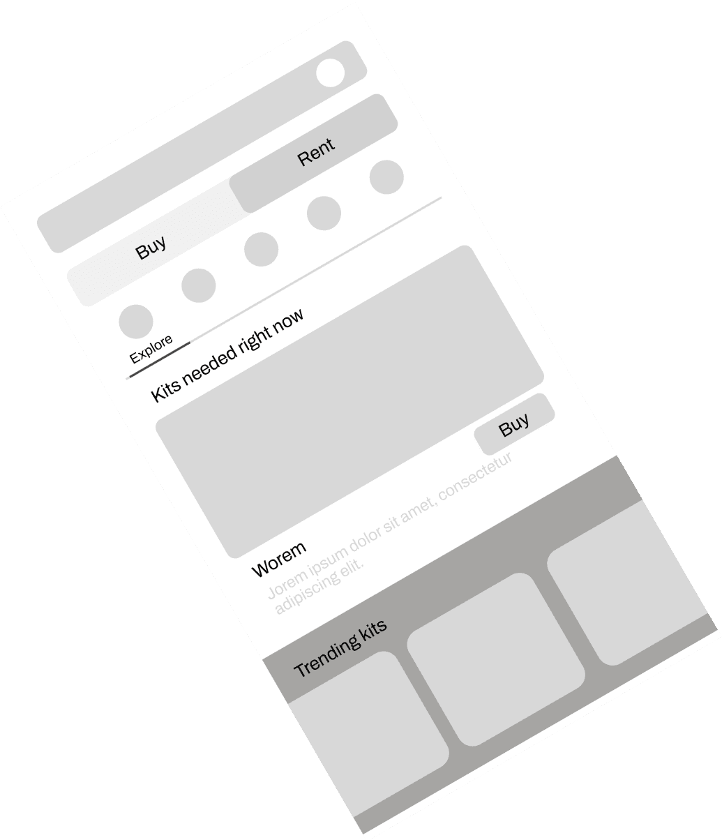
The design execution for KITIFY focuses on delivering a seamless and engaging user experience for design students. The homepage features a clean layout with clear call-to-action buttons for exploring, renting, or auctioning stationery kits. Product pages showcase kits with high-quality images and detailed information, while the rent/auction process is simplified for ease of use.
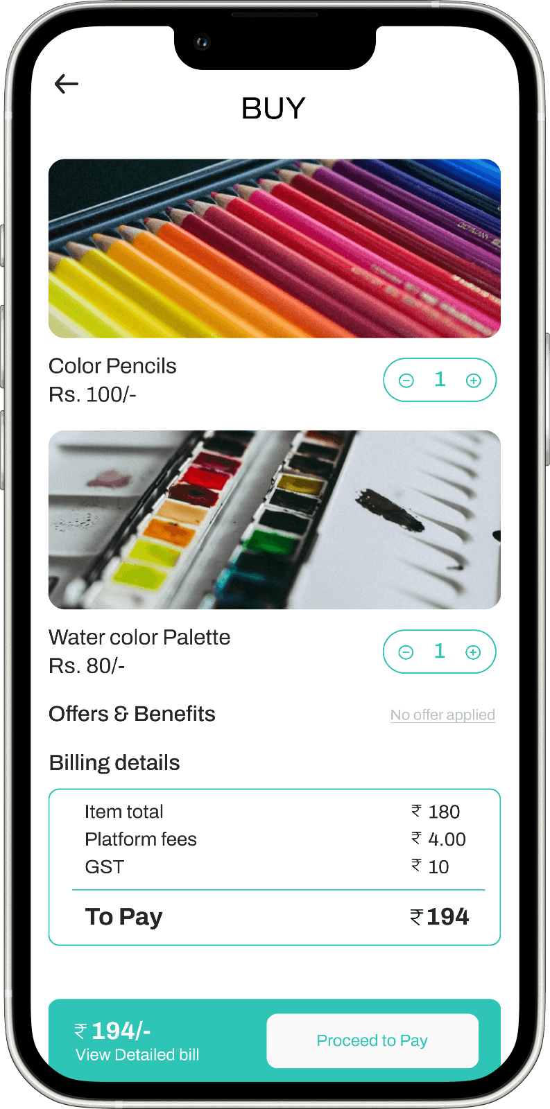
The checkout page is streamlined to ensure efficient transactions. The design emphasizes user-centered navigation and visual consistency across all screens.
By prioritizing intuitive interactions and responsive design, KITIFY aims to provide a cohesive and accessible experience on both desktop and mobile devices.
Harmonizing the
look
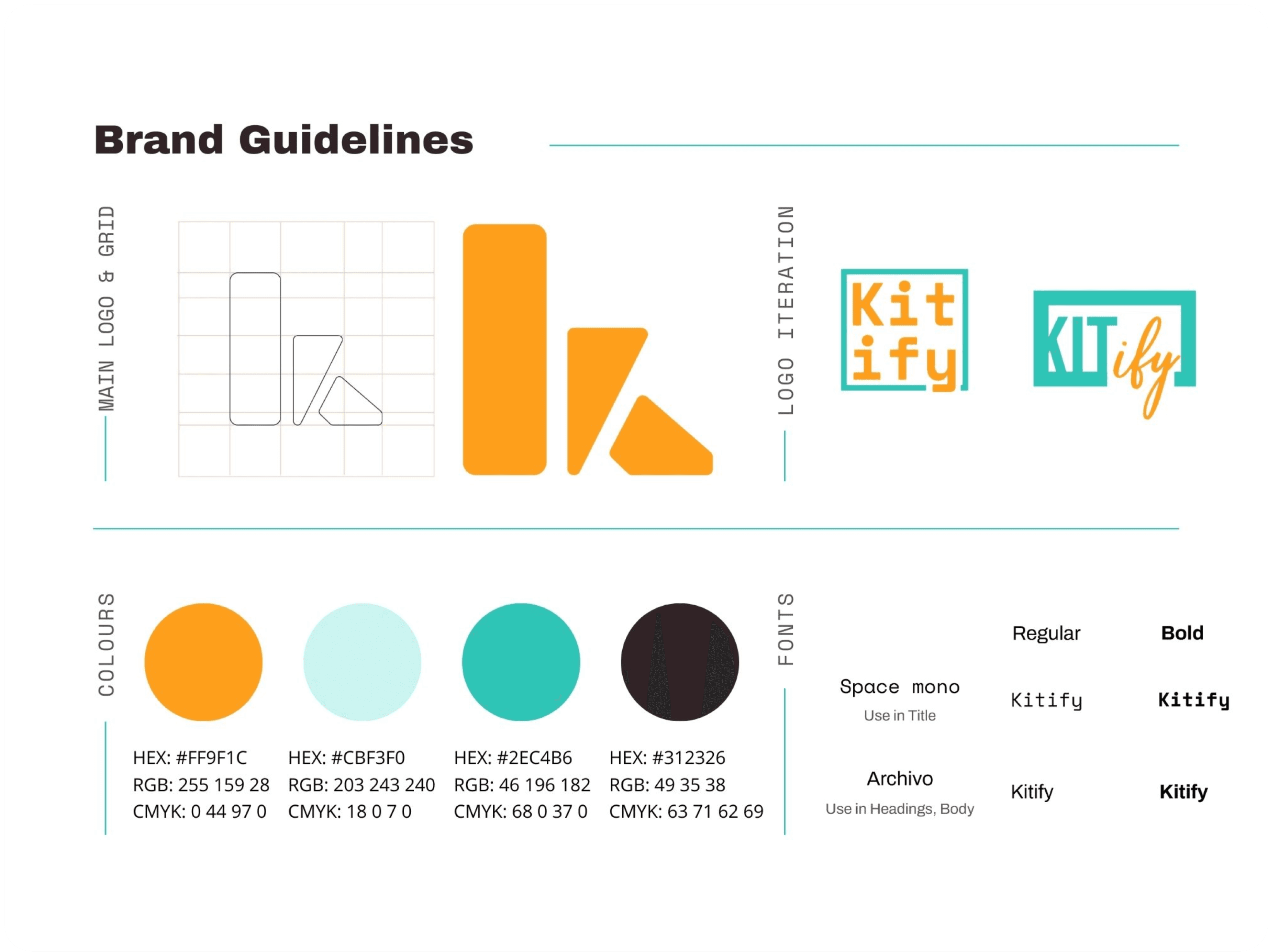
The Kitify brand guidelines establish a strong foundation with clear instructions on colors, fonts, logo, and layout, ensuring a cohesive visual identity. To further enhance the guidelines, adding secondary colors, defining typography hierarchy, and establishing a distinct brand personality would be beneficial. Overall, they offer a solid starting point for creating a consistent and recognizable brand.


Building the blueprint
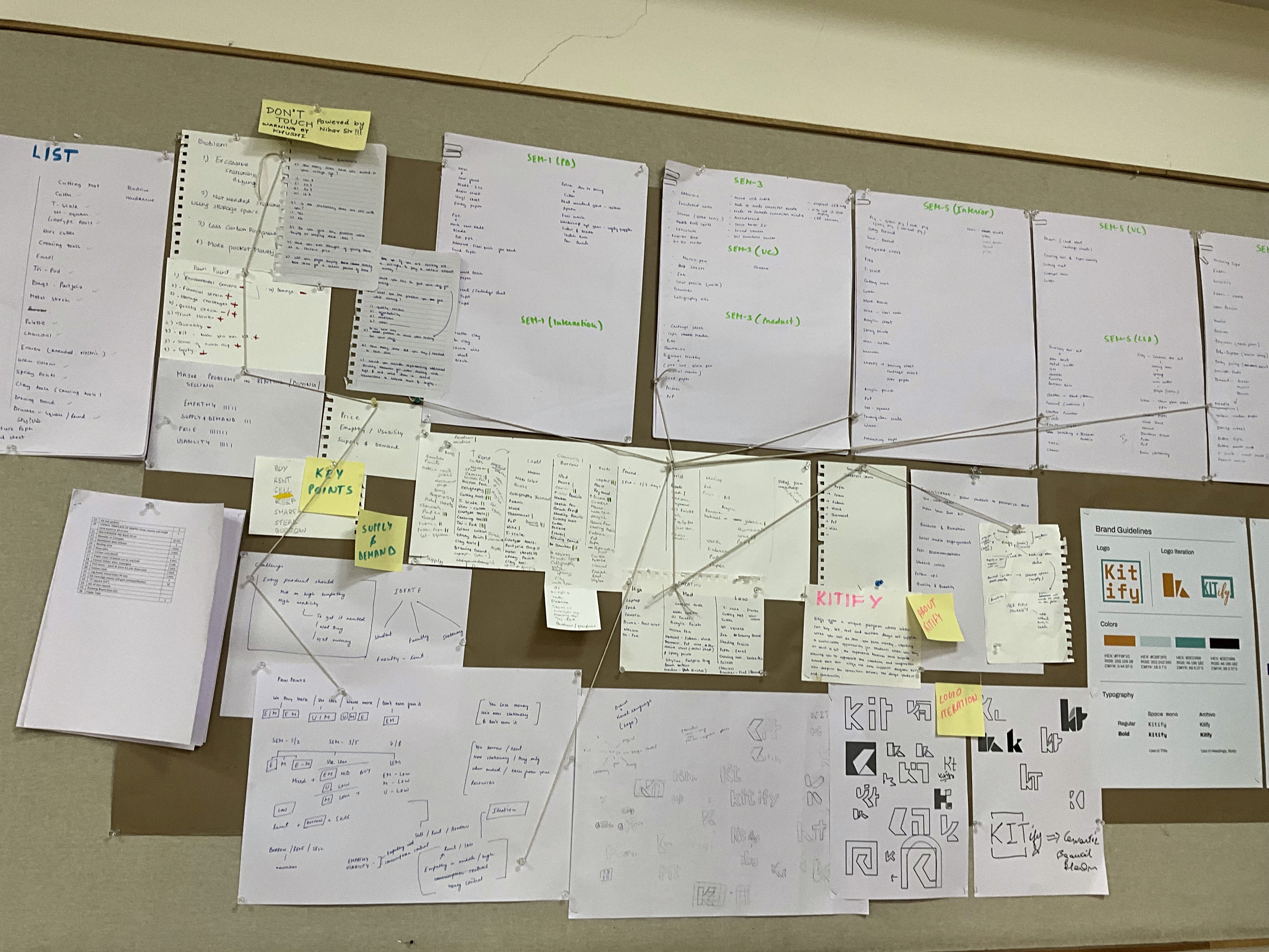
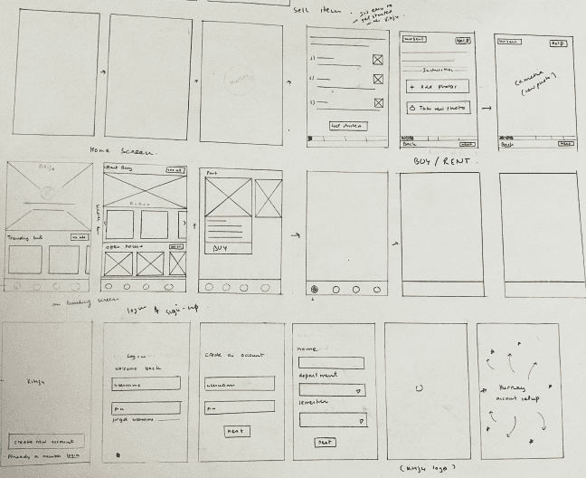
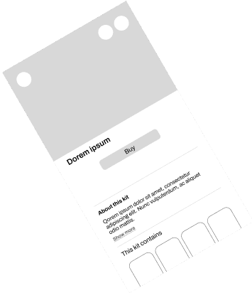
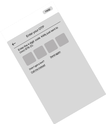
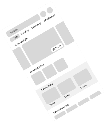
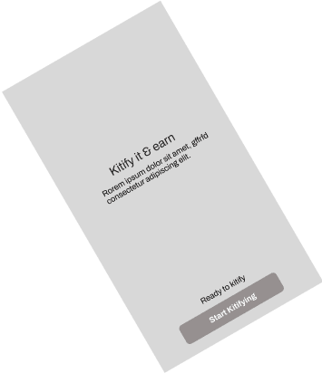
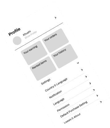
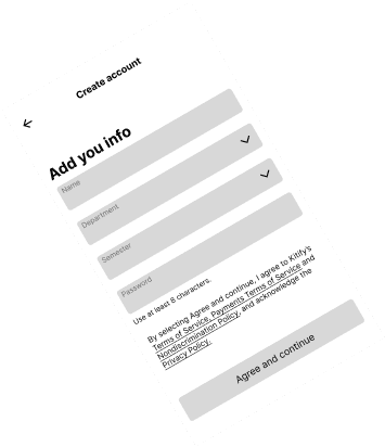
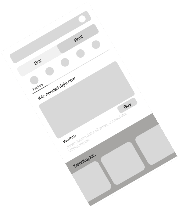
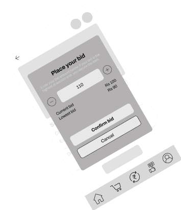
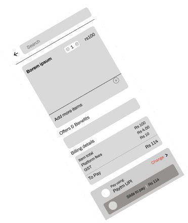
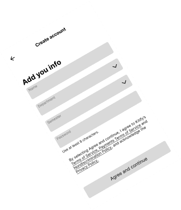
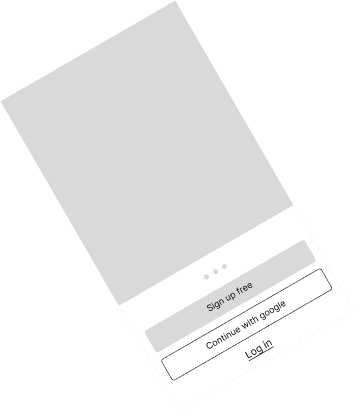
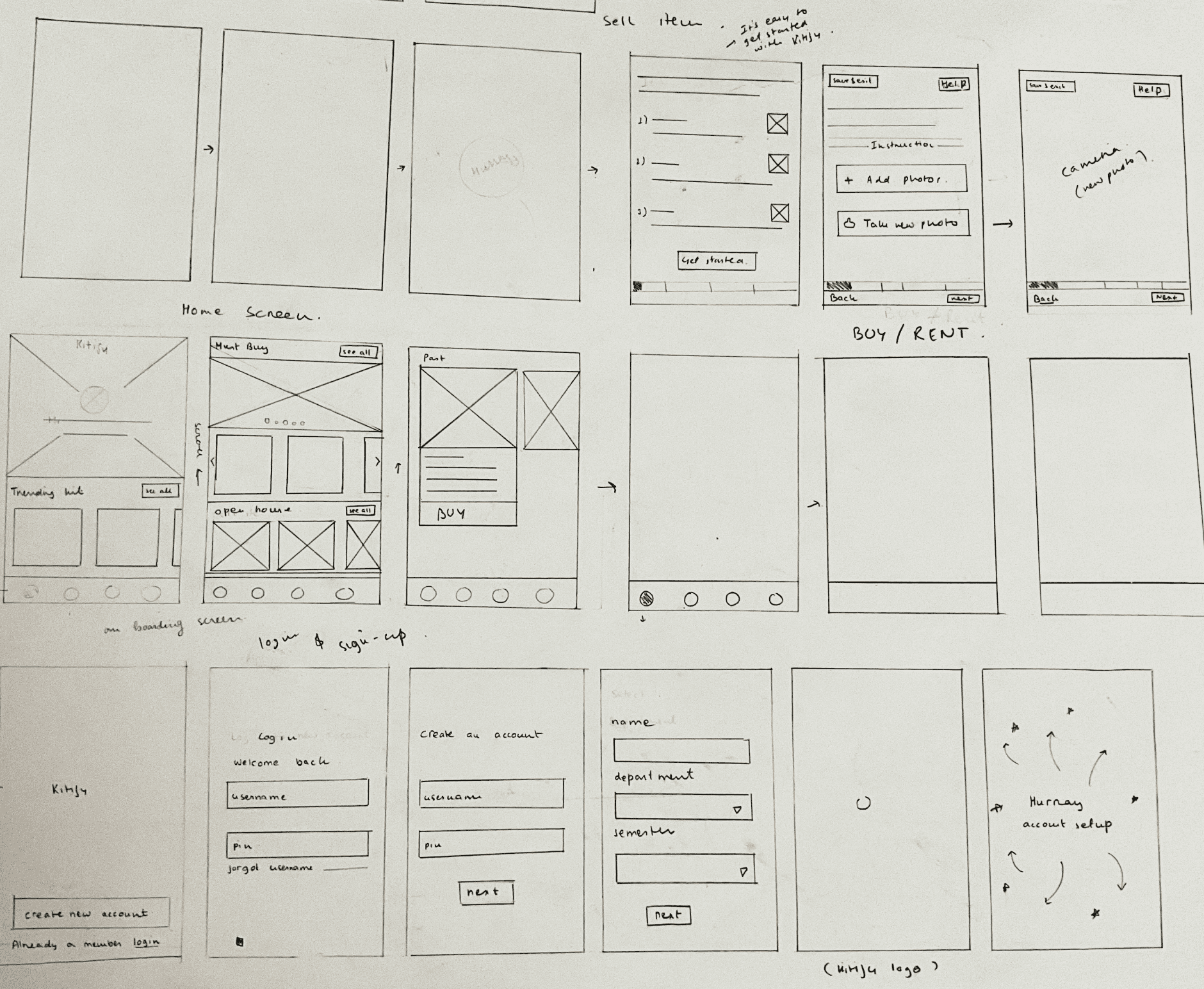
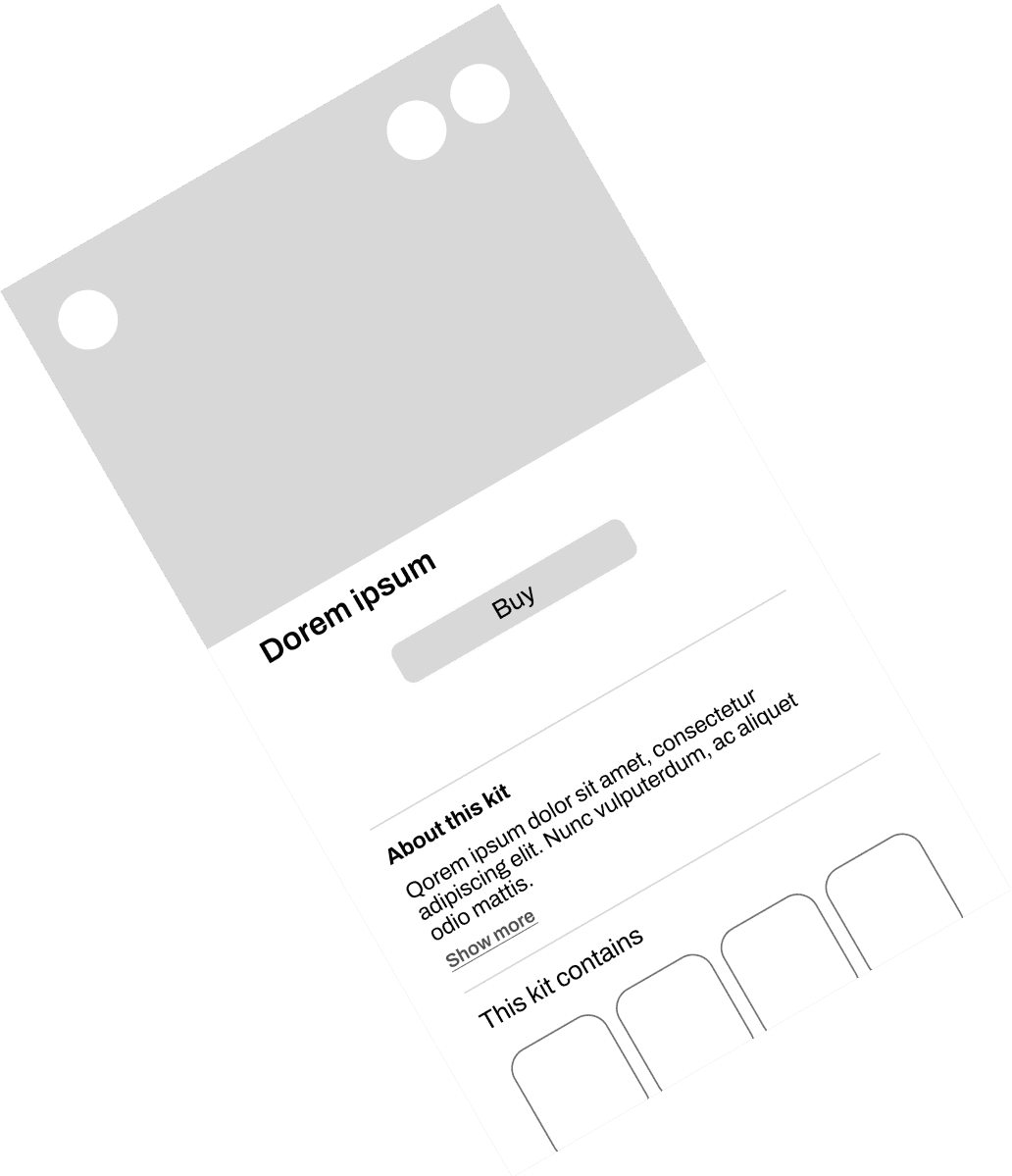
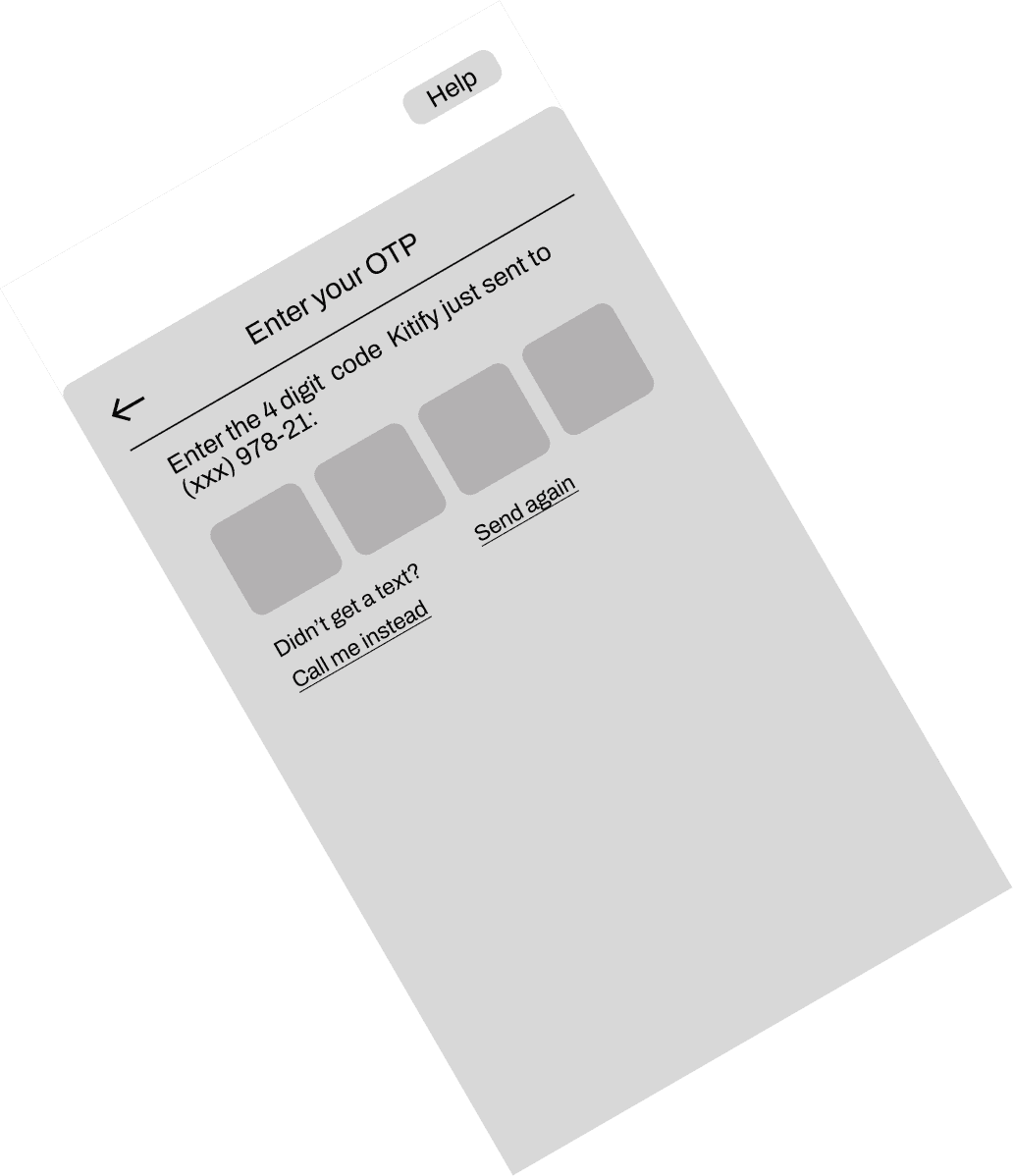
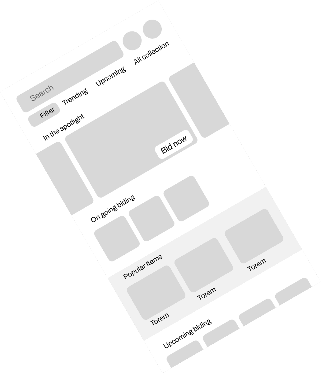
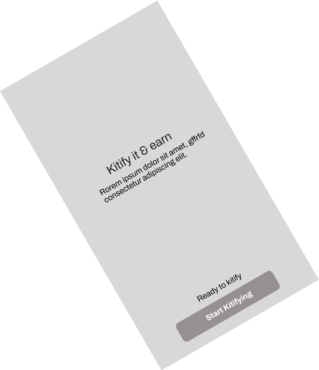
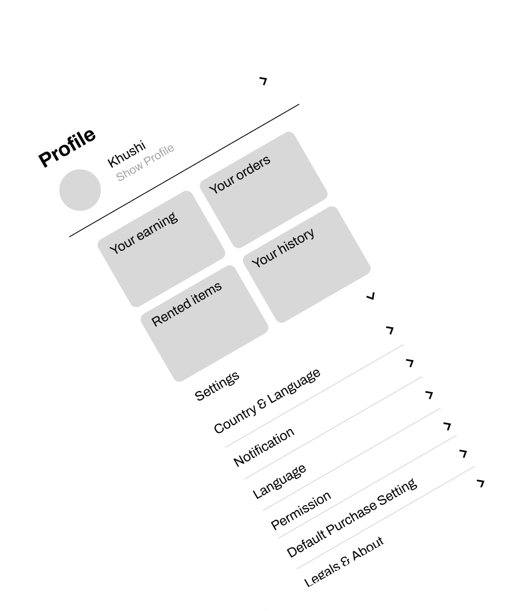
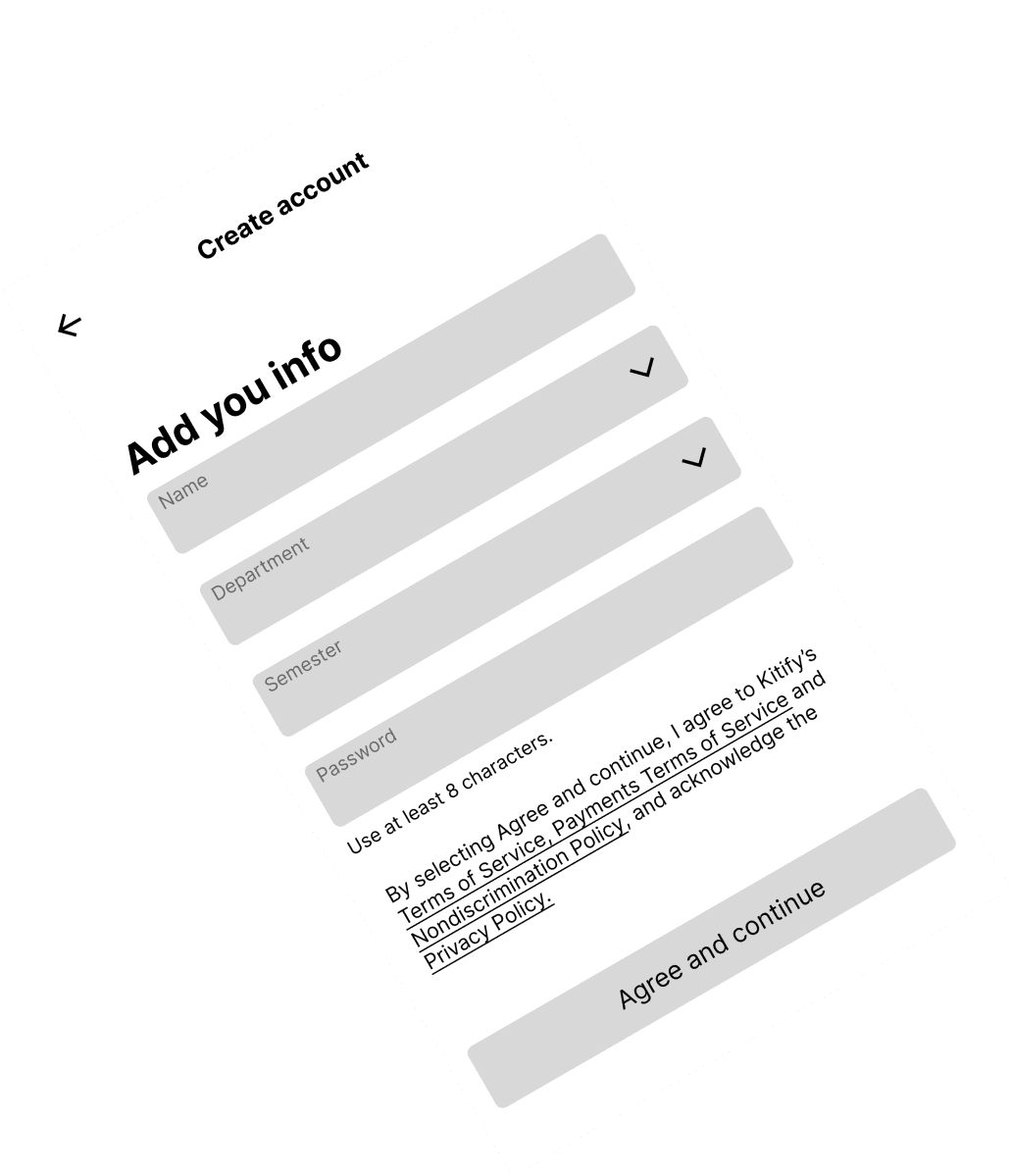
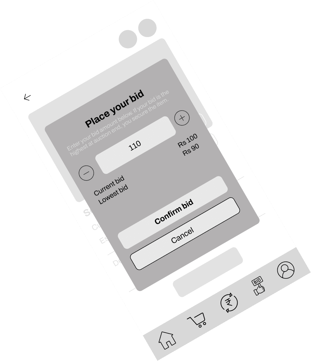
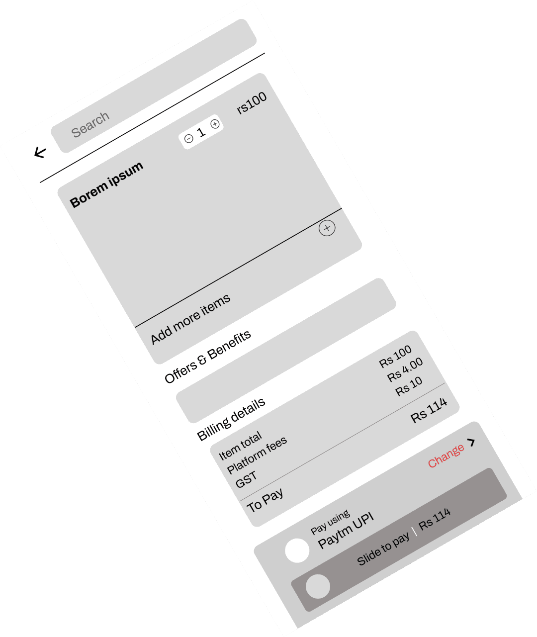
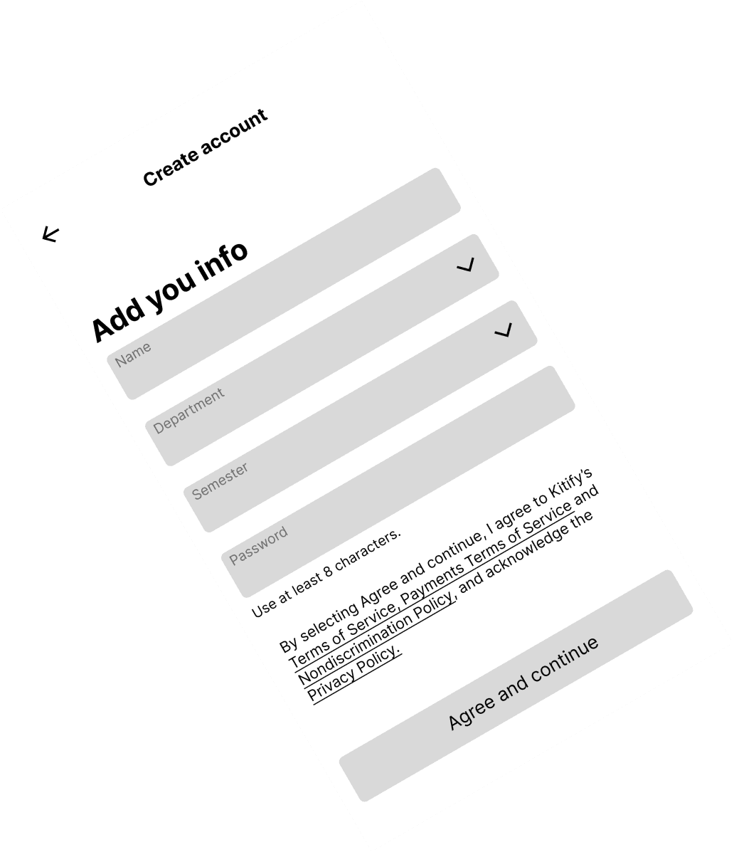
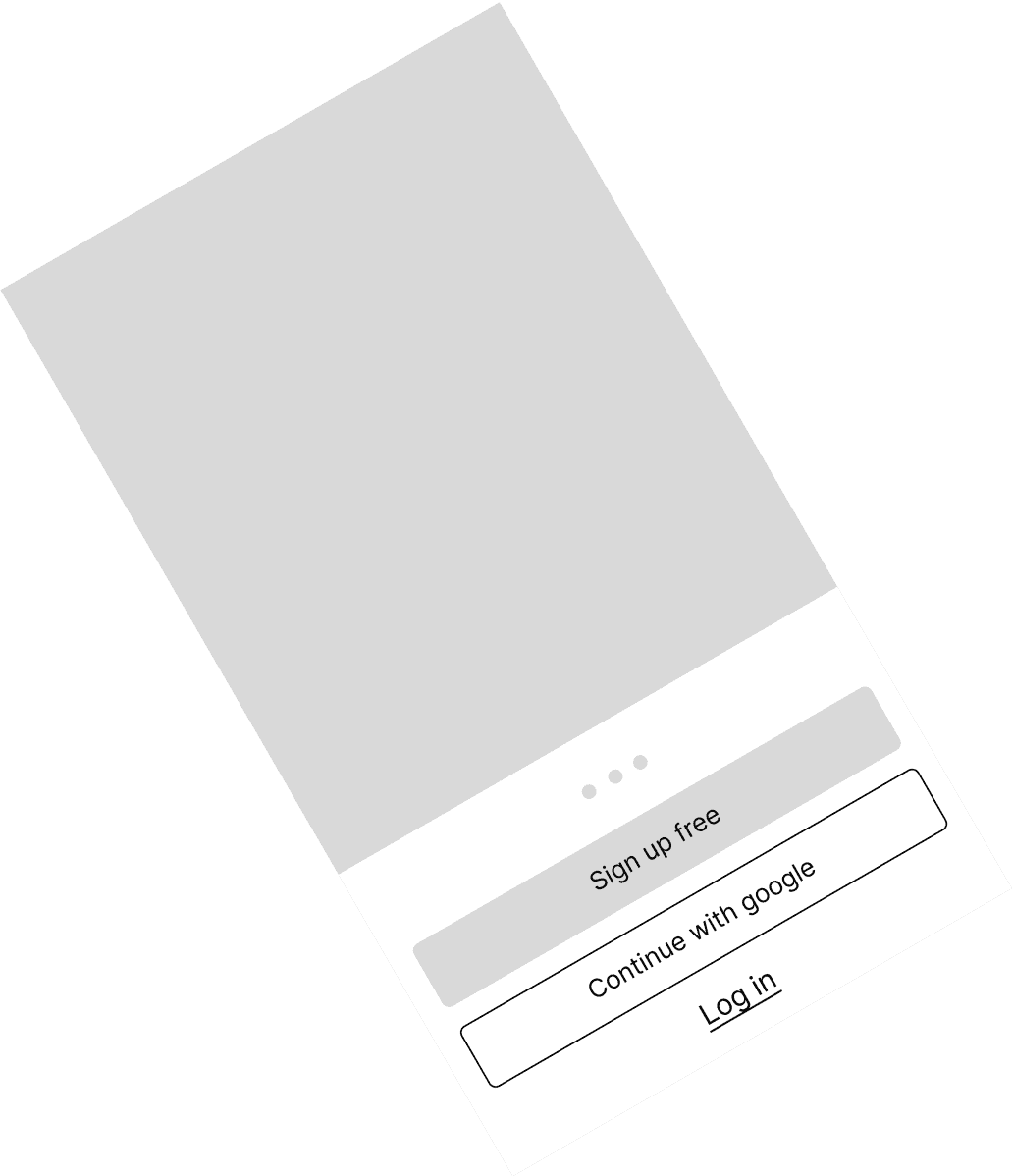
Low-fidelity designs were made first to establish core structure and functionality quickly, allowing for early feedback and iterations. This approach helps address layout and user flow issues before investing in detailed visuals.













Heuristic Evaluation
Remaining Time for OTP
Notification for Approval
Message when Canceling a Bid or Making a Bid
Buy Icon Variation or Naming at the Bottom
Filter Option Inclusion
Help & Contact Option Separation
Order History Uniformity
Aesthetic Changes (Spacing, Logo, etc.)
Refining the details
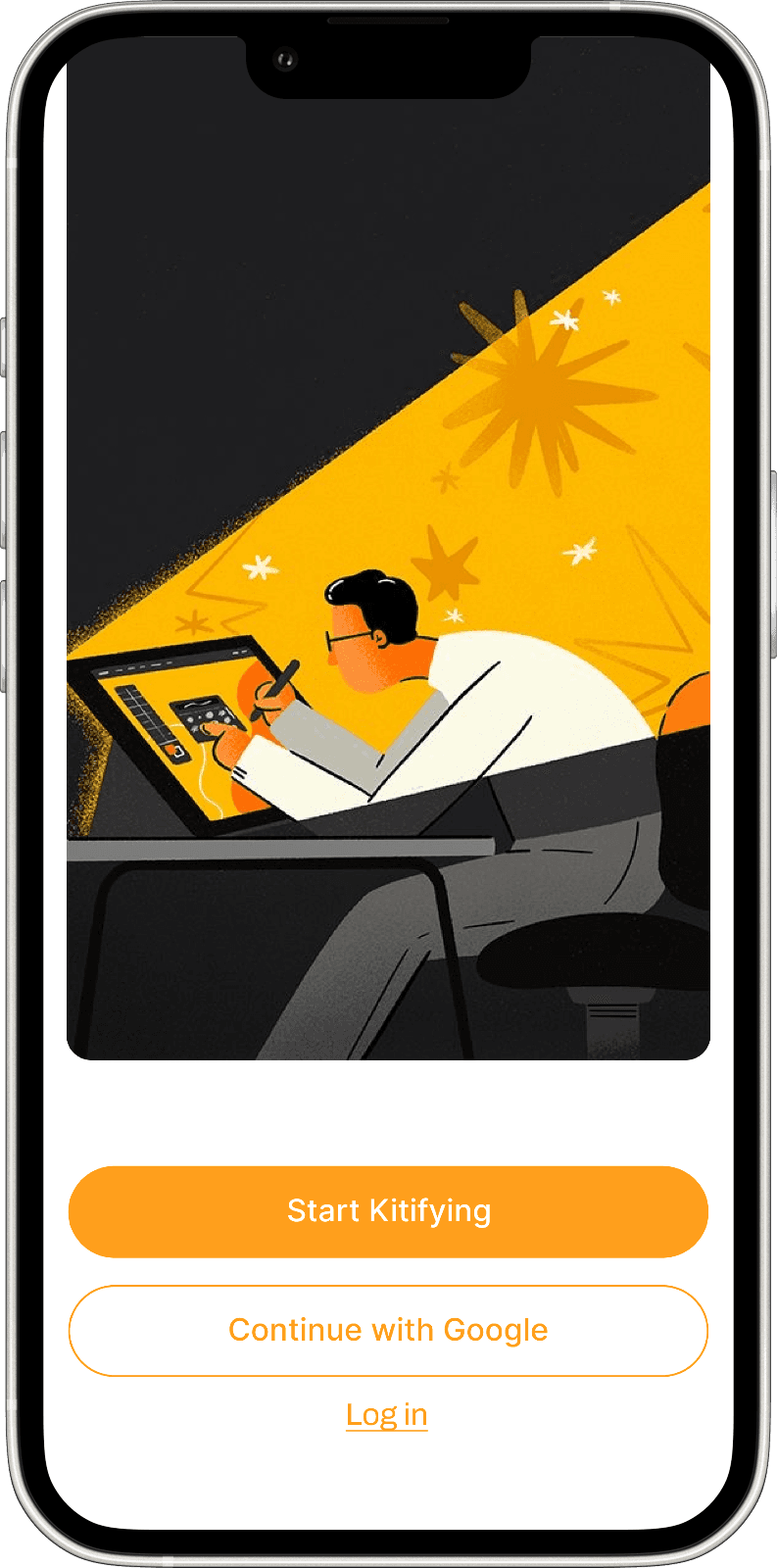
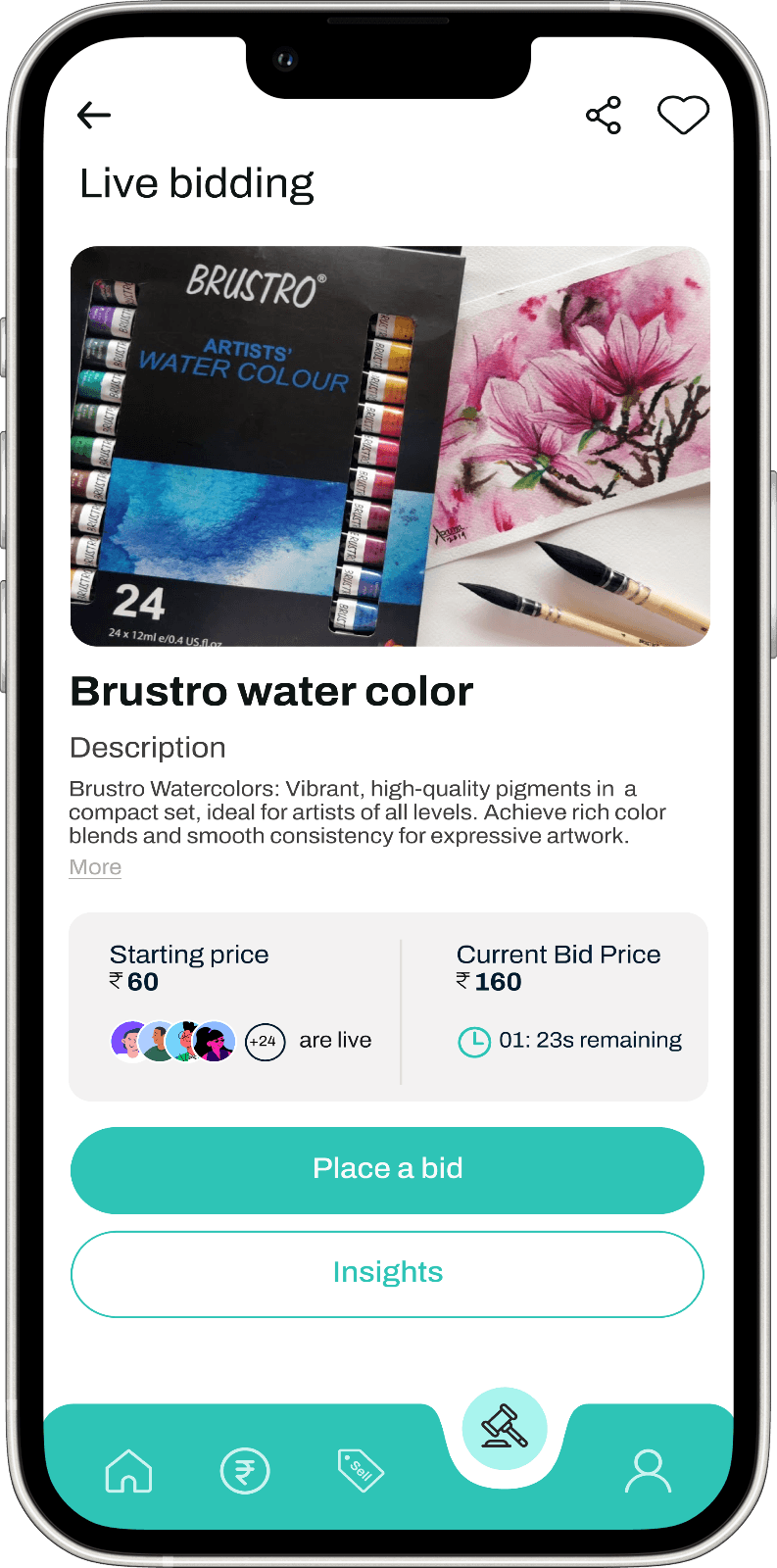
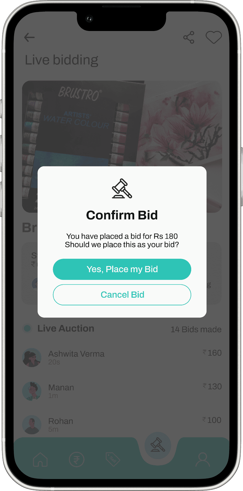
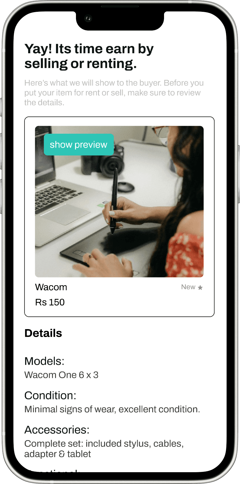
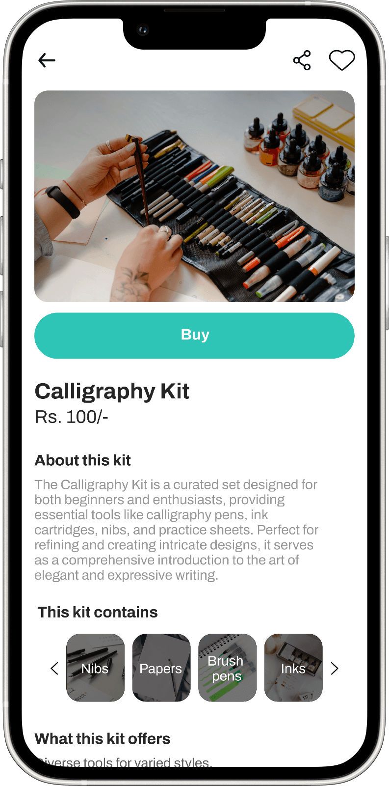
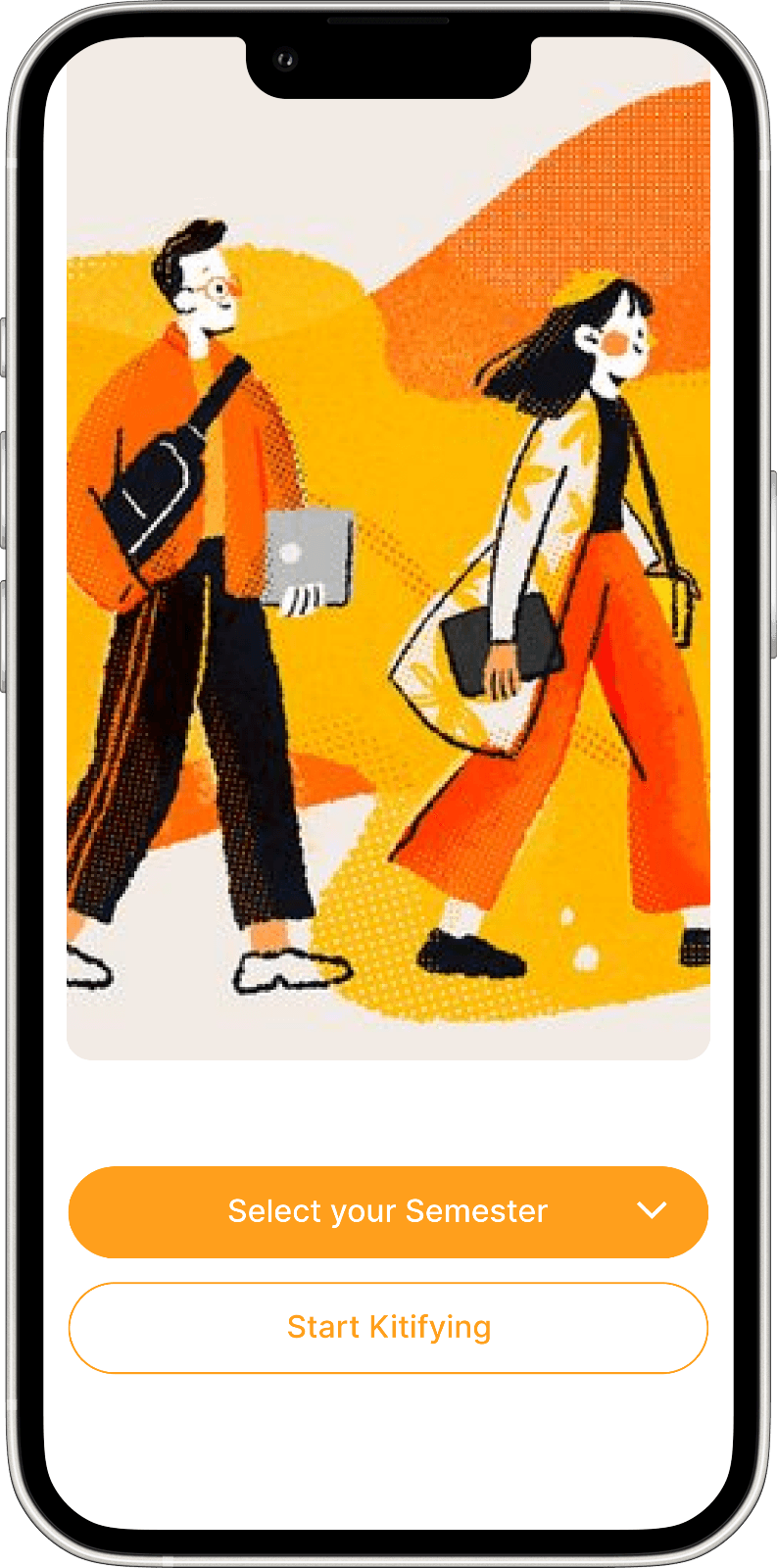
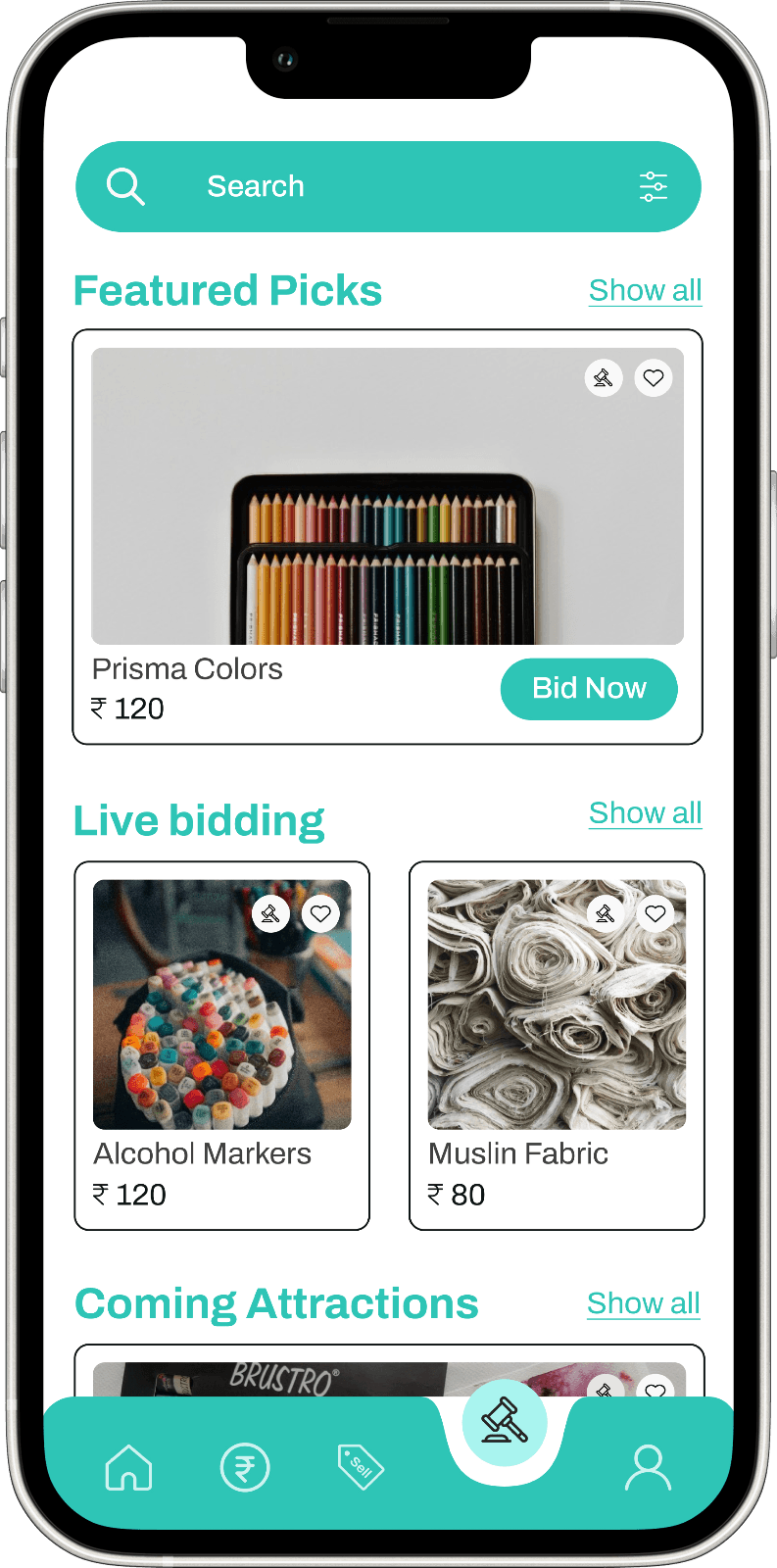
After conducting a heuristic evaluation, changes were implemented to address identified issues, leading to the development of the final design. This iterative process ensured the design met usability standards and user needs effectively.



















Wrapping it up
After iterations and heuristic evaluation, the design was finalized to be user-friendly and functional.
The road ahead
Impact
The key impact of this app lies in promoting a more sustainable lifestyle by reducing carbon footprint. It goes beyond functionality, fostering a sense of value and empathy towards the items being shared or rented, emphasizing responsible consumption and environmental consciousness.
Key Learning
Designing the app taught me to understand user needs through interviews, prioritize usability based on studies and peer feedback, conduct effective competitive analysis, and improve prototyping skills. This process deepened my knowledge of UI principles, particularly in establishing effective information hierarchy.
Next Step
Designing a kiosk facilitates quality checks, approvals, and addressing user concerns in a physical space. This addition ensures a comprehensive support system, fostering trust and reliability within the user community.
Prioritizing backend development is crucial for a robust and scalable app. This step involves optimizing data management, security, and overall performance, laying the foundation for a seamless user experience.
Kitify
Curated stationery kits for design students with easy sell, rent, and auction for economic and ecological benefits.
Understanding the Bigger Picture
Kitify
Domain
E-commerce
Platform
Mobile Application
Duration
3 weeks
Eco-Friendly and Budget-Conscious Stationery Kits for Design Students
Providing design students the chance to buy or lease carefully curated stationery kits, all while including a special feature for exclusive and high-end goods. Maintaining a focus on Eco-friendliness, the platform encourages the sale or lease of personal items, thereby tackling both green and budgetary challenges.
The
context
The proposed platform aims to provide design students with sustainable and affordable stationery solutions. It offers carefully curated stationery kits that can be bought or leased, as well as a marketplace for students to buy or sell personal stationery items. By promoting resource sharing and reducing waste, the platform aims to address both environmental and financial concerns for design students.
The
problem statement
The conventional "buy-and-own" mindset prevalent among college students results in unnecessary waste, resource depletion, and a significant carbon footprint. The constant acquisition of items adds up, negatively impacting both the environment and personal finances.
Understanding the Bigger Picture
Understanding the Bigger Picture
The Journey:
from chaos to clarity
Empathize
User research
Interview
Personas
Define
Ideation
Analyze
Ideate
Navigation flow
Branding
Wireframes
Design
User Interface
Accessibility
Test
Heuristic Evaluation
Takeaways
Feedback
Digging for
Insights
I interviewed students from various departments and semesters, examining their challenges, preferences, and the dynamics of demand and supply. This research helps us pinpoint items that can be rented, evaluate their usability, and comprehend emotional connections.
The Struggle Is Real
Environmental
concerns
Students are increasingly conscious of their impact on the environment but often struggle to reconcile this with their purchasing habits.
Financial
strain
Limited budgets lead to prioritizing cheaper items that might not be durable or Eco-friendly, exacerbating the cycle of over-consumption.
Sense of
ownership
Balancing the personalized tools and shared resources poses a challenge. Doubts about the quality of rented items versus owned ones.
Storage
Challenges
Dorm rooms and shared spaces make storing unnecessary items a hassle, yet the cycle continues due to the perceived lack of alternatives.
User Persona
User personas were created to understand the target audience's needs, goals, and challenges, ensuring designs are user-centered. This approach helps tailor solutions effectively to real user problems.

Navigation flow
Navigation flow was designed to ensure a seamless and intuitive user experience. It maps out the user journey to make interactions smooth and efficient across all screens.


Purpose in
every detail
The design execution for KITIFY focuses on delivering a seamless and engaging user experience for design students. The homepage features a clean layout with clear call-to-action buttons for exploring, renting, or auctioning stationery kits. Product pages showcase kits with high-quality images and detailed information, while the rent/auction process is simplified for ease of use.
The checkout page is streamlined to ensure efficient transactions. The design emphasizes user-centered navigation and visual consistency across all screens.
By prioritizing intuitive interactions and responsive design, KITIFY aims to provide a cohesive and accessible experience on both desktop and mobile devices.
Harmonizing the
look
The Kitify brand guidelines establish a strong foundation with clear instructions on colors, fonts, logo, and layout, ensuring a cohesive visual identity. To further enhance the guidelines, adding secondary colors, defining typography hierarchy, and establishing a distinct brand personality would be beneficial. Overall, they offer a solid starting point for creating a consistent and recognizable brand.

Building the
blueprint
Low-fidelity designs were made first to establish core structure and functionality quickly, allowing for early feedback and iterations. This approach helps address layout and user flow issues before investing in detailed visuals.

Heuristic
Evaluation
Remaining Time for OTP
Notification for Approval
Message when Canceling a Bid or Making a Bid
Buy Icon Variation or Naming at the Bottom
Filter Option Inclusion
Help & Contact Option Separation
Order History Uniformity
Aesthetic Changes (Spacing, Logo, etc.)
Refining the
details
After conducting a heuristic evaluation, changes were implemented to address identified issues, leading to the development of the final design. This iterative process ensured the design met usability standards and user needs effectively.


Wrapping it up
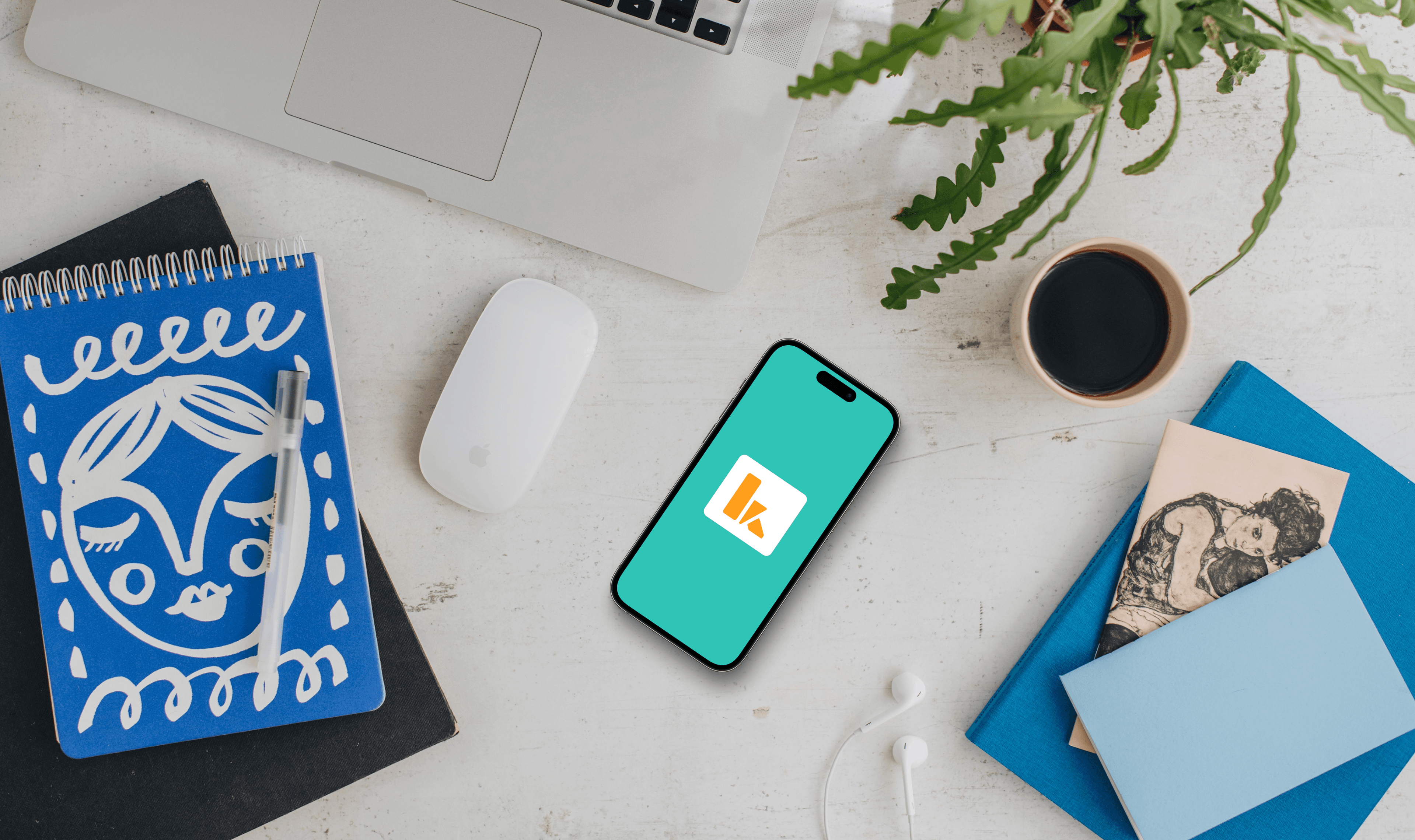
After iterations and heuristic evaluation, the design was finalized to be user-friendly and functional.
The road ahead
Impact
The key impact of this app lies in promoting a more sustainable lifestyle by reducing carbon footprint. It goes beyond functionality, fostering
a sense of value and empathy towards the items being shared or rented, emphasizing responsible consumption and environmental consciousness.
Key learnings
Designing the app taught me to understand user needs through interviews, prioritize usability based on studies and peer feedback, conduct effective competitive analysis, and improve prototyping skills. This process deepened my knowledge of UI principles, particularly in establishing effective information hierarchy.
Next step
Designing a kiosk facilitates quality checks, approvals, and addressing user concerns in a physical space. This addition ensures a comprehensive support system, fostering trust and reliability within the user community.
Prioritizing backend development is crucial for a robust and scalable app. This step involves optimizing data management, security, and overall performance, laying the foundation for a seamless user experience.
